“QA” for the most delicious vegan cakes:
First of all, we tasted the cakes, for a better understanding of the products we were going to talk about. The girls do an awesome job and it’s refreshing to know the sweet treats you eat contain nothing but fruits.
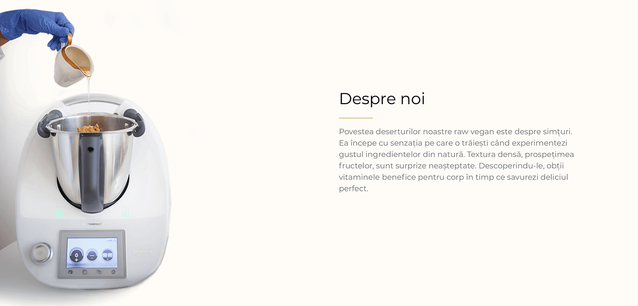
Finding the right positioning:
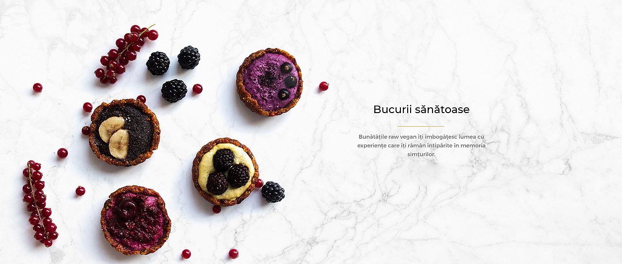
We wanted to emphasize the healthiness of the products, so we positioned the brand accordingly- Flavors of nature.
And it wasn’t enough:
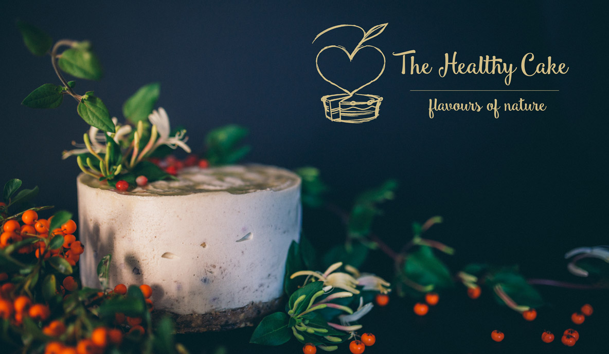
The Healthy Cake needed a new visual identity, according to the brand personality and the brand archetype that we had chosen.
UX & UI - was also necessary.
The new positioning needed to be continued online. And the website was asking us to keep the “the flavors of nature” essence in the UI development too.
Without copy it gets sloppy:
So we continued the brand story through the product descriptions and also the content generated on homepage and side pages.
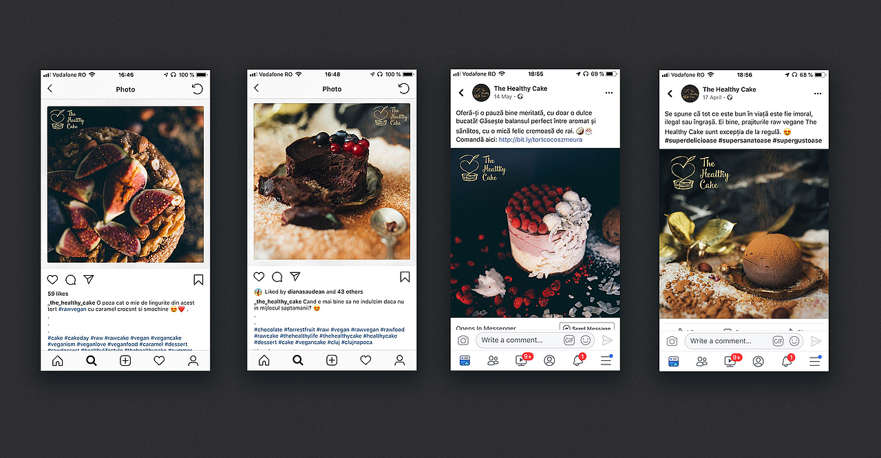
Let’s make the brand likeable:
The digital communication strategy we developed for the brand had its roots in the innocence and the purity of their products. We integrated the brand archetype in both art and copywrite direction, in the way we engaged their followers with the brand.